
There is plenty of DIY graphic design tools out there, which is great if you are on a budget, but it can never replace a professional graphic designer. Just because you can do something, it doesn't mean you should!
However, for your social media posts and other day-to-day needs, this post will help you create some professional looking graphics without it looking like it was done by someone in kindergarten!

This blog post is going to take me all the way back to 1998 when I was a student of graphic design. Listening to my lecturer bang on about design rules. I clearly remember him saying to us - "There are rules in design!" He encouraged us to break these rules...But he said you need to know them first before knowing when to break them.
I'm going to share with you some of these rules that are NEVER EVER to be broken!
1. Consistency is Key!
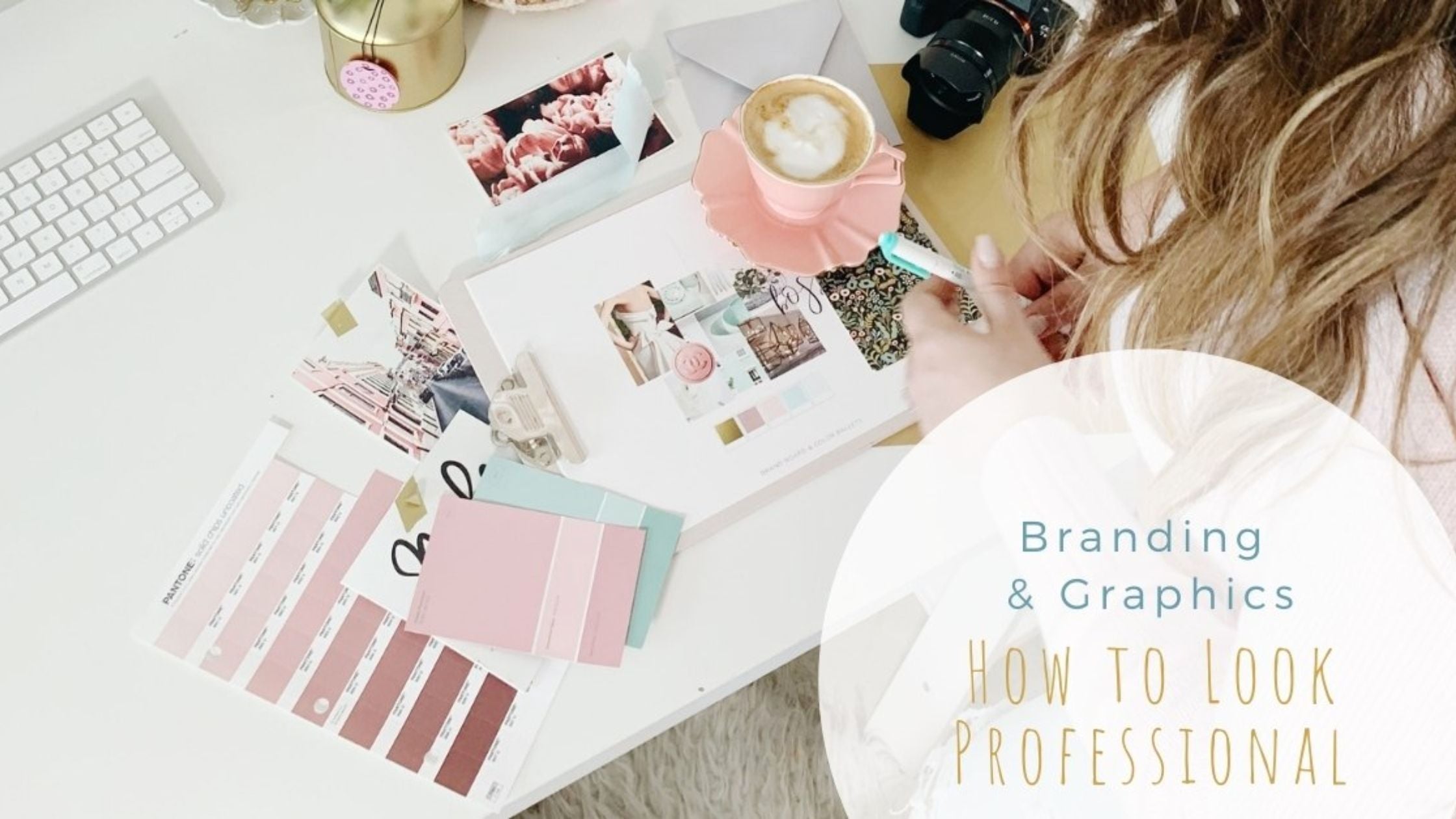
The biggest mistake some businesses make is not being consistent.
Being consistent can come in loads of different forms; from consistent pricing to consistent branding - and I know a lot about branding! If you have had a logo designed by me, I would have provided you with a style guide.
Any awesome graphic designer should have given you something like this. Your style guide is used to keep your branding consistent. A style guide usually includes the colour breakdowns for your online presence and other branding, and a suggested supporting font that goes well with your logo and branding.
Your style guide should be applied to all your business documents and little things like Facebook ads and supporting images that you should (if you have time) be able to do yourself.

2. Keep it Simple
Don't pick 6 different fonts and 20 different colours, because you think they look good. Choose 3 colours from your logo and stick to them... If you don't have a style guide and you are not sure what colours are in your logo, there is a great tool you can use for that called Pick Pick (mac).
There are plenty of others, but I like that one. ColorPick Eyedropper is another option that is available as a Google Chrome extension.
These tools give you the breakdowns of the colours in CMYK, RGB and the hex codes. I know fonts are awesome and I know, there are so many choices. BUT DON'T DO IT! You already have your awesome logo, that should be the star of your branding!
By using a "hey look at me" font you are taking the attention from your logo and confusing the message. I like to use 2 maybe 3 max that complement not compete with your logo. And it would usually be from the same font family; like a regular and a bold or a regular and italic, or all 3.
Check out Open Sans to see what I mean about a font families (also referred to as styles). By sticking to the one font family you are guaranteed to look professional. Avoid using anything too light because it will be difficult to read if it's going to be printed.

3. Don't Squash or Stretch a Font or Logo
This is NEVER acceptable and I'm pretty sure a designer dies every time you do it! Please don't do it - choose a different font! This is a sure-fire way to tell an amateur from a professional.
As for a logo, a designer has spent hours designing the perfect logo for your business. It's never cool to try and fit a logo that has been designed to be horizontal into a square space.
Most awesome designers would have given you a few different versions of your logo. If not, ask your designer to recreate one that will fit in the space you need it to fit. 

4. Beware of Bad Kerning
What is kerning I hear you ask?
Kerning is the space between letters. Most good fonts will consider the letter spacing when it is designed. You usually won't need to worry about it, but some free or cheap fonts can be really bad and needs to be kerned by eye. Check out these hideous examples of really embarrassing kerning fails below.

Image Source (Left): EGoatMan on imgur
Image Source (Right): Reddit
5. Use the Right Software
It's true for any task, that you should always use the right tool for the job, and design is no different. Microsoft Word is an amazing word processor and it's no surprise that it's one of the most popular programs.
However, it is not a design program!
For reasons I don't understand, there are options in Word to use "Word Art". But once again, just because you can, doesn't mean you should. If you are trying - or have tried - to design a logo (or anything for that matter) in Word - you really need my help! Please get in touch and suffer no more! 
6. Don't Use Clip Art in a Logo
Like Microsoft Word, clip art has its uses. When I say clip art I don't just mean those you can freely get from any Microsoft program or even "free" logo makers from places like Canva.
I also mean images you have found on the internet (just like fonts, always check the licensing).  Clip art should NEVER be used in a logo for a few reasons;
- They are public images, meaning anyone can use them;
- They're not unique to you or your business;
- There is nothing stopping someone else (like a competitor) using that exact same image for their logo too;
- You cannot trademark it;
- If you have found it on the internet, it may be someone elseÕs work and covered by a copyright, and therefore illegal to use
7. Say No to All-Caps in Script Fonts
This is the one rule that really grates my goat!
So many people make the mistake of using all capitals in a script font - I see it way more often than I would like!
Script fonts are ornamental in nature and the way they are designed to work, is with a lowercase letter. Displaying them in all uppercase is a sure way to spot an amateur and make your text illegible.
The exception to this would be with a monogram, because monograms are designed to work together as initials and not as a word. 
8. Don't Centre-Align Paragraph Text
This is an interesting one, because sometimes even I am tempted to center text, but as a rule it's considered a no-no, unless you are designing a certificate or maybe, if appropriate, a menu.
Centred paragraph text looks amateur and worst of all, it's difficult to read. Text alignment is important for guiding your reader through the text  So remember these tips next time you decide to do your own graphics.
There is no shame in outsourcing to the professionals. Time is money! If consistency is your pain point and you are just not sure how to keep your business branding consistent, I'm happy to help. Click here to go directly to my private calendar and book in a time for a chat.
Words by:

Owner & Creative Director at Design Capital,
Donna Bouma
www.designcapital.com.auDonna Bouma is a qualified Graphic Designer and teacher of Graphic Design. She has over 20 years' experience and has designed hundreds of logos. Her passion is working collaboratively with businesses who do not have an in-house graphic designer, to design marketing materials that will elevate their business brand to stand out. Whether you are setting up a new business venture, or require on-going design services, Donna can help you to consistently ensure you always look professional.


